Project Details
Team
Individual Project
Timeline
January 2025 - March 2025
Tools & Methods
UX Strategy, Wireframing, Prototyping, Typography studies, Color exploration
Role
Visual/UI Designer
Overview
This project focused on conceptually redesigning Southwest Airlines' website, specifically the homepage, destination exploration, and trip booking flow to simplify the user experience through improved visual hierarchy and content strategy.
The Problem
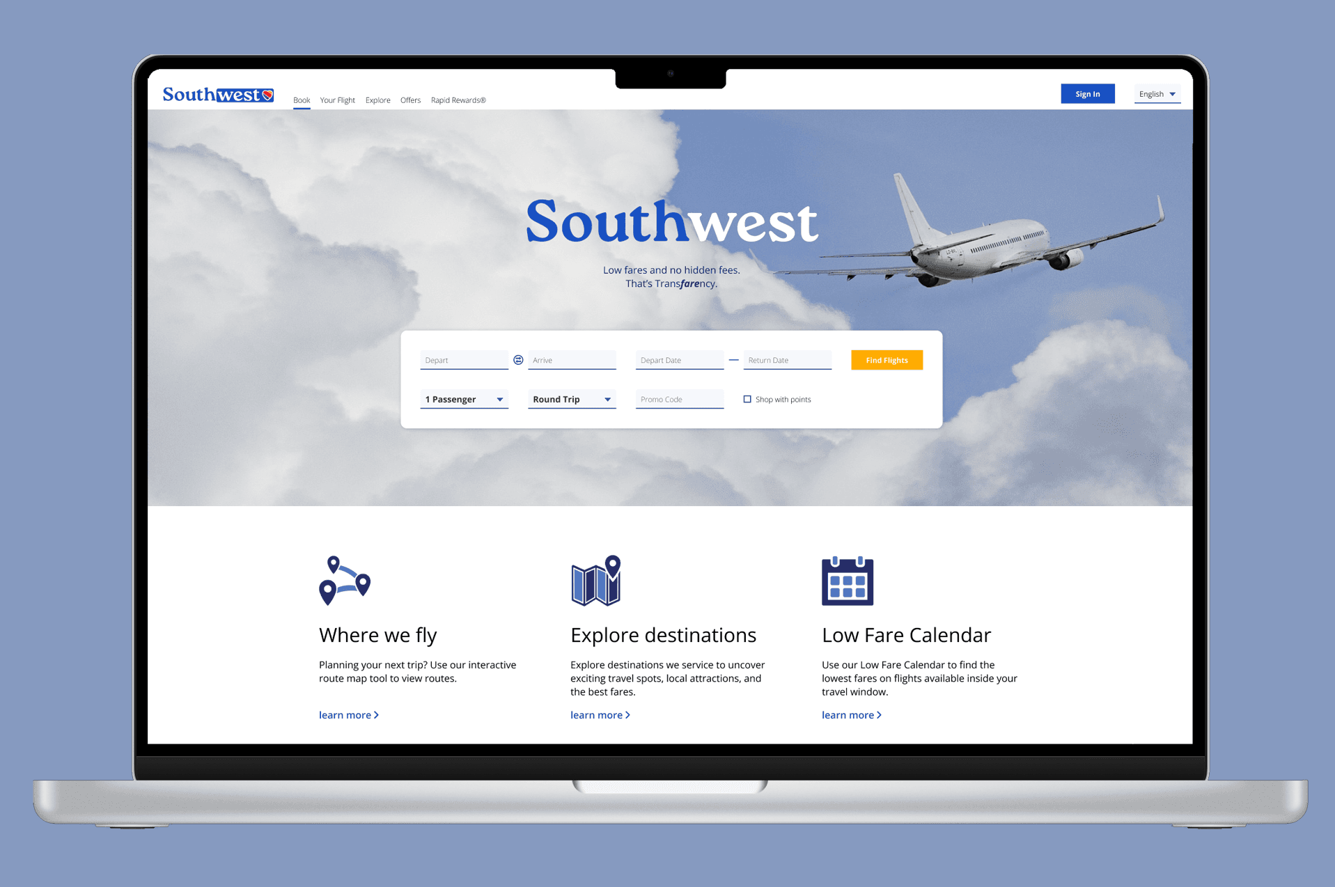
Southwest Airlines' website suffers from poor visual hierarchy and choice overload. Competing colors and text sizes misdirect user attention and make it difficult to complete tasks or find crucial information.
The "Explore Destinations" feature that is meant to inspire bookings just presents walls of text that fail to engage users or promote Southwest's hotel and car rental partnerships.

Image: Original Southwest website with confusing visual hierarchy
Goals
User Goals
- Book vacations faster and more confidently
- Discover destinations in an engaging, digestible way
Business Goals
- Increase flight bookings
- Drive hotel and car rental conversions through the platform
Research & Inspiration
Competitive Review
Amtrak: simple, streamlined layouts with destination imagery
Delta: clean information hierarchy
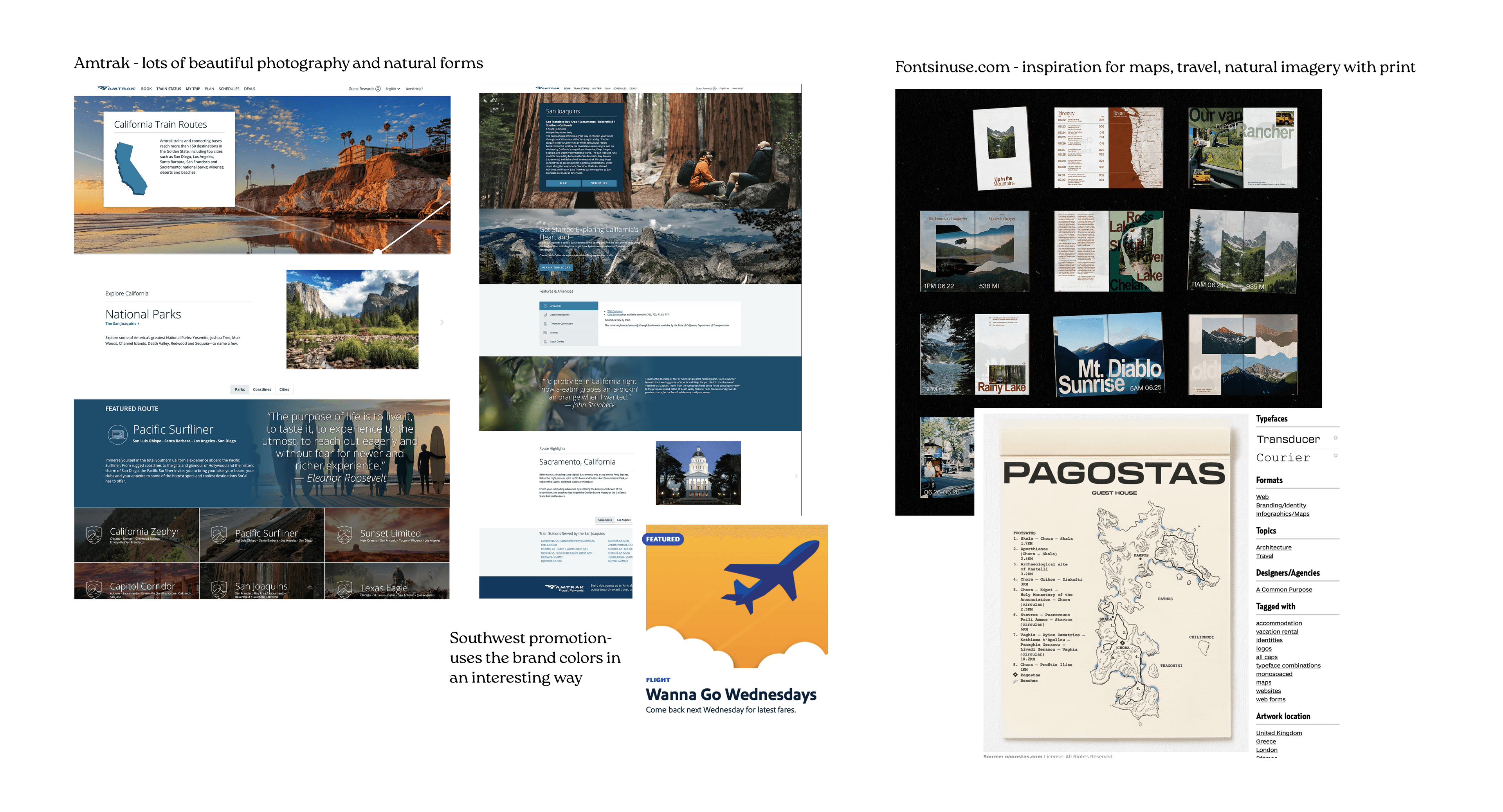
Image: Competitive analysis and research mood board
Key insight:
Successful travel sites balance information density with visual appeal. They use imagery to inspire users to take action while keeping navigation simple.
Design Process
Exploration & Wireframing
I sketched layout options for the homepage and destination page to explore how to organize dense information without overwhelming users, choosing a hierarchical layout to accommodate destination descriptions while maintaining visual interest.
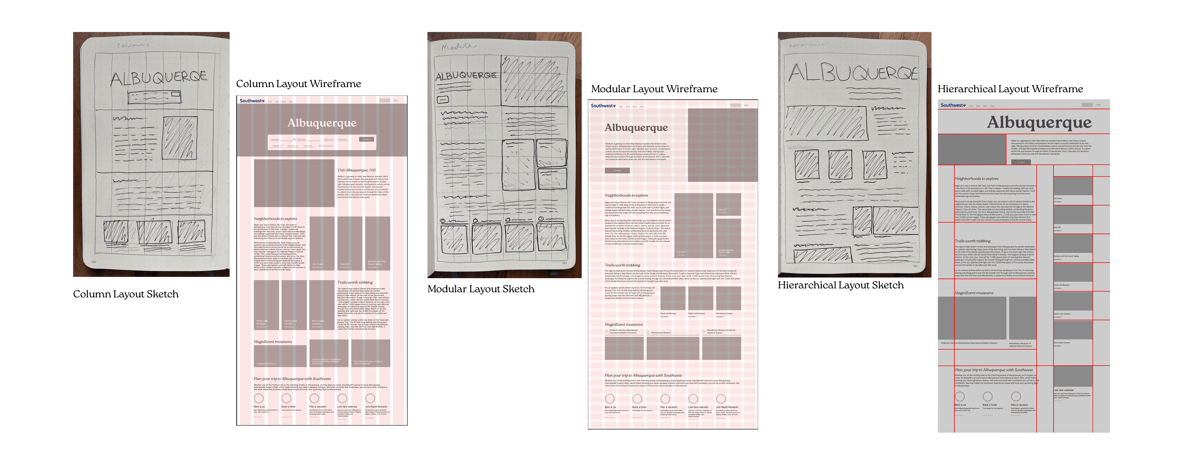
Image: Early sketches and wireframe explorations
Typography Strategy
Testing process:
- Explored geometric and neutral sans-serif options
- Evaluated x-height, spacing, and readability at different sizes
- Tested pairings for contrast and harmony
Final choice:
Headings: Roca (rounded serifs, fluid and inviting)
Body: Open Sans (neutral, readable, professional)
This pairing feels natural and welcoming while providing readability and a sense of trust.
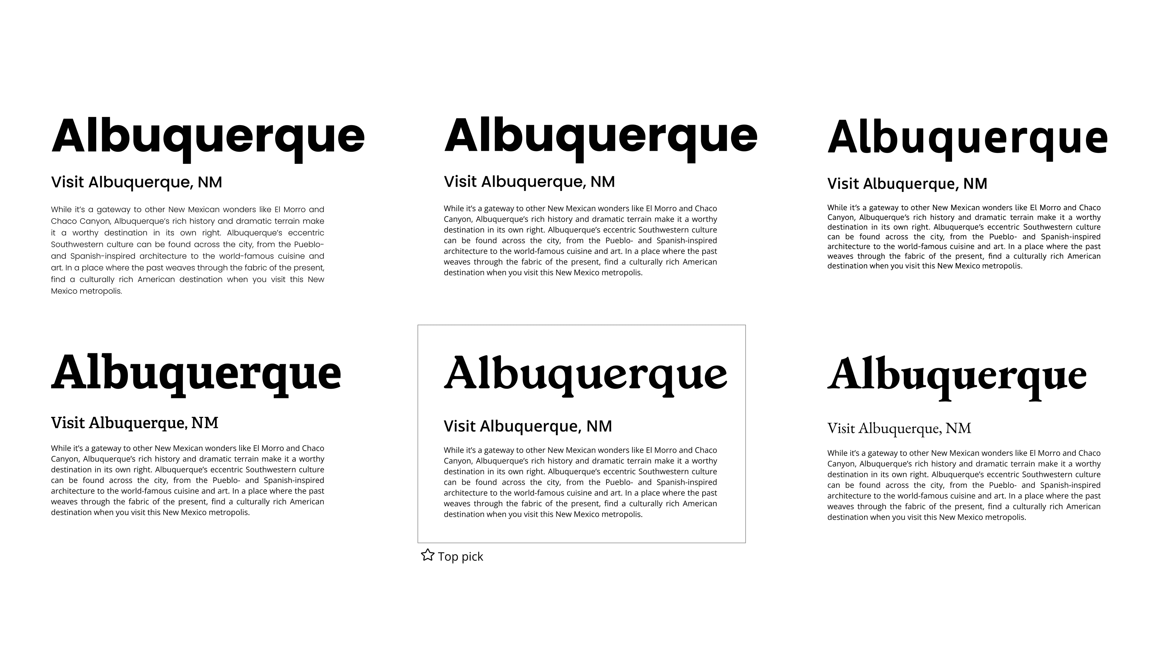
Image: Typography studies and pairing tests
Color Exploration
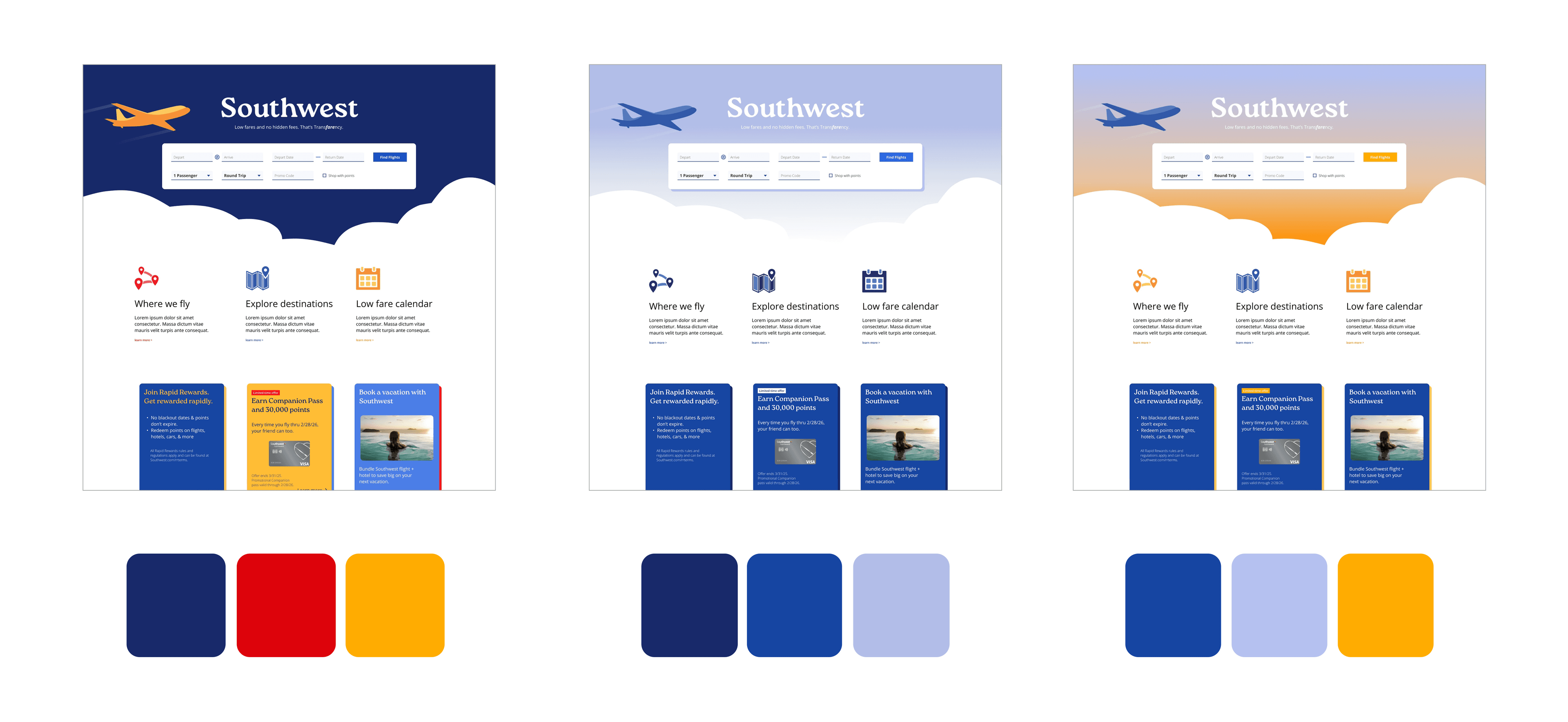
Image: Three color study iterations following triadic, monochromatic, and complementary schemes
Final direction:
A complimentary palette with blue tones and yellow accents to create visual hierarchy while complementing destination photography.
Solution
Homepage
- Large hero image with simplified booking flow to call the user to action
- Reduced visual clutter to guide attention purposefully while keeping key information and advertising accessible
Video: Final homepage prototype
Destination Pages
- Digestible content sections with supporting imagery
- Integrated hotel and car rental promotions within content flow
- Modular structure adaptable across destinations
Video: Final destination page prototype
Explore Destinations & Low Fare Calendar
- Component-based design for scalability
Video: Explore destinations interface
Video: Low Fare Calendar interface
Mobile Responsiveness
- Mobile responsive design to ensure core features and content are prioritized on smaller screens

Image: Mobile responsive designs
Outcome
This redesign emphasized the importance of typography, color, imagery, and layout working together to create a cohesive experience.
The design needed to be scalable and implementable, which meant creating a system that could be easily maintained and updated across hundreds of destination pages. It successfully makes each destination page feel tailored and compelling, while allowing for varying content lengths, different image types, and inconsistent promotional offers across hundreds of destinations.